Math with Sophie
Learning math was never this easy!
PREVIOUS INFORMATION
Branding and design
Web design
Educational videos
Interactive ebooks
Math with Sophie is a website dedicated to teach high school math. In this project we were in charge of everything related to its branding, the production of educational videos, interactive ebooks and its overall design.
Since it is an educational website, we decided to use a simple design. We wanted to avoid Sophie being just an off camera voice. Because of this one of the main objectives was to help the students get to know their teacher. To achieve this, we decided to use Sophie’s face as much as possible. In the cases where this was not possible, we used her handwriting.
Branding and graphic design for Math with Sophie
From the very beginning we went for high contrast so it would stand out to the students. Because of this we used the idea of contrast as main motif in the branding and overall design.
The first element of contrast was the colour. We used only three colours: white, black and the main hero, yellow. These three colours have high contrast between each other (that is one of the reasons they are used in traffic signs so often). Depending on the medium in question, we would use a different colour background and everything else would be in the other two colours.
Secondly the next element of contrast was the writing. We used not only typed fonts but also handwritten ones. This would be closer to the notes that Sophie or any student would normally take in class, making it feel more natural to the students.
The logo is a combination of these 2 elements of contrast. We typed MATH (which gives it a more sober design) and used Sophie’s own handwriting for WITH SOPHIE (which makes math seem closer and easier to reach).
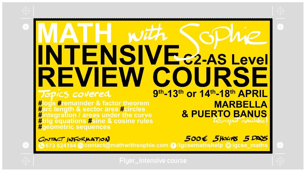
Lastly, the first flyer we developed to advertise intensive course, follows again this pattern. The use of high contrast both in colour and in the fonts to stand out. In this occasion yellow is the background colour. We used black for the most important parts as it has highest contrast against yellow and white for the rest.
We wanted to avoid Sophie being just an off camera voice. Because of this one of the main objectives was to help the students get to know their teacher.
Web design
You can find the complete website here: http://mathwithsophie.com/
For Math with Sophie’s website, we followed the same pattern seen in the branding. 3 colours: yellow, black and white and the use of both manual and typed fonts.
The biggest difference is the addition of the Sophie photos. These pictures will help the students personify their teacher (a really important matter as we have discussed in other sections). All the photos were taken in the Pop-Media’s studio.
These photos are treated to fit with the overall design and therefore we chose to use black and white photos with high contrast.
The home page is designed as a one-page website. The different sections are in different bands: about, services, quotes and contact. Each on of them change colour to give more dynamism without breaking the overall global design.

Educational videos
One of the main pillars of Math with Sophie is the creation of educational videos. Students nowadays learn in a completely different manner and we consider that visual learning was key for the success of the project.
After several versions regarding the presentation of these videos, we decided what would be the basic principles to follow.
First of all, Sophie had to be the face of the project. Due to this she would be the first thing the students would see. We consider that the success of the biggest YouTube channels and other social media pages is due to the personality of the protagonist. For this reason, instead of hiding the teach like most of the math educational videos do, we wanted to emphasize her presence.
Regarding the scenario for the videos, we tried a simple but familiar one; a classroom. The back of the scene would have the blackboard with formulas of the subject in question and the subject or question explained in the video. To give it more dynamism we used coloured chalk and a three point lighting.
Lastly, and after several tries, we decided to use two cameras. The first one would focus Sophie and the second one her desk, on an overhead shot of the iPad where Sophie would cover the lesson. The lessons would start with Sophie in fullscreen while she introduces the subject. Then this shot would minimize giving more importance to the lesson in the iPad, but never forgetting about Sophie during the whole lesson.
You can visit the YouTube channel here (still under development).
Interactive books / eBooks
As support for the Math with Sophie lessons, we developed interactive books. These books open in any electronic device and allow many more extra functionalities. For example, you can add images in galleries, video, links to different parts and even mini tests inside the book itself.
For its design, we followed the same pattern we used in the branding. We wanted to give these books the appearance of notes taken by a student. Because of this the handwritten fonts have even more importance. Even the lines look like they were drawn by a pen or pencil.